It’s been an age since I’ve done one of these posts - which is totally my own fault - but I have in the background been keeping up with them. Maybe one day I’ll get round to filling in the gaps but for now let’s plough on with where I got to!
The last time I did a Winter palette was 2 years ago - here in the UK we were in a pandemic lockdown and my emotional, and colour, sense was in a very very different place. Looking back at that post I can see how my my colour-sense has evolved in the years since. I’m still as much drawn to certain colours depending on what’s going on around me but It feels like it’s grown up a bit since then too. Maybe that’s just generally how I’m feeling and I’m just subconsciously seeing it in other places!
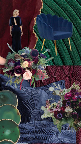
WINTER PALETTE CHOICES - CENTERING COSY AND UPLIFTING.

Winter has, for me, still been about being cosy this year (when isn’t it?!) but there’s definitely been a sense of deep-diving into those cosy colours and embracing them. I’m certainly ready for Spring to appear, but I’m not hankering after the spring colours in the same way I have in previous years. And although I’d say my Winter colour choices this time around have a depth to them, they’re not cold or overwhelming - or at least I don’t think so - and I see them as having a lightness and uplifting side to them too.
The plums/oxblood reds of the palette chime so nicely together and give a warmth. Both of them lean slightly more to the blues than the red/pinks but far from making them cold I think gives them a sense of pragmatism and sophistication.
Navy is such a complex colour, but for this palette again I’m leaning towards a warmth and so it’s not a grey-navy or a cobalt but a more a royal - on it’s way towards a teal but staying firmly on the blue side of that line. And I think that’s why the forestry green works so well with them. Again it’s firmly green and not teal, so clearly distinct from the blue, but with a frosted side to it more akin to fir trees and misty forests than bright emeralds or grass-greens.
To round the palette off I’ve gone with a gentle magenta, a frosted dusky rose and a warm gold, all of which I think of as being used sparingly but are absolutely necessary to stop the deeper colours from going too far.
This palette has leant really heavily on textures too. Alot of my palette planning draws on texture, but I realised looking back it’s not something that I’ve discussed much. For me, some of these deeper tones when considered as velvets or cashmere or even quilted fabrics, takes on more of a personality and resonance than if it was a flat colour. And it’s where accent colours used sparingly - like metallic gold on a room fitting for example - really come in to their own.
PUTTING THE WINTER COLOUR PALETTE INTO PRACTICE.
You may have picked up that alot of my colour chat for this palette seems to have an interior design theme to it, and that’s not deliberate but isn’t that surprising either. I should have probably added a disclaimer at the start of this post that I am in the middle of planning the decorating of our family room - a nice-but-not-enormous sized north/east facing room that has to work very hard for all of us, and which is currently full of toy-detritus. In decorating, and getting a new sofa after our old faithful of 12 years has thoroughly given up, I’m wanting to create a grown-up yet child-friendly space. One that feels sophisticated but is functional, inviting and not overwhelming.
And in what is the least surprising twist ever I would say the majority of the ‘feels’ that I’m getting from this winter palette are ones that I’m aiming for in this room!
As I’m writing I’ve not yet decided on final colours, other than for the new sofa, but I am hoping to track this project and document it. It’s been a LONG time since I’ve felt I’ve been able to get so creative with our living spaces and really follow my colour-gut and I’m incredibly excited about it. (My husband is very much less so after the stack of paint charts and magazine clippings I’ve been collecting for mood board purposes!).
Of course, if I do document what we do then I’ll do a proper post, and there might be the odd bit on social media (if I remember). And as ever I’d love to know your thoughts on the palette - is this a bit too dismal for you or would you like to go and deep dive into the richness of them? Or do you actually think I’ve left it a bit late for this palette and you’re full-steam ahead towards Spring?
I should add as well that I’ve started putting these palettes up on my Pinterest! I do use Pinterest for research (to a point) and to help get some of my ideas and inspiration in order - it' saves me lots of printing, paper and cutting/sticking and gives me a way to pull together threads of thoughts I’ve had. And as a visual planner and learner it’s a great tool. As well as for colour planning I use it for design inspiration as well as sharing and finding small business motivation, encouragement and wisdom. If you’re on there then do give me a follow!
Pin Me and save this post for later!