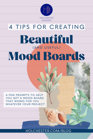
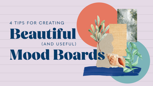
‘Mood Board’ can be a bit of a buzz phrase and so, for some people, it can seem daunting and like something to stretch for to achieve. But in practice once you realise it only needs to fit what you need it too, suddenly it's a really fun and freeing process.
There are, of course, caveats to that statement that I’m sure people in more corporate creative agencies would attach to it, but for most people it really doesn’t need to be a complicated process. Of course, just because it’s not complicated doesn’t mean we don’t all need some help sometimes so I thought I’d pop down on paper my 4 main tips and techniques that I use myself when putting a mood board together in the hope that it’ll inspire some thoughts that you might not have otherwise had.
Before I get stuck in to prompts though, let’s consider how/where you’ll be putting it together. There’s a few different ways of course, and where you are and what you have to had are a massive factor. I’m always a big proponent of pen and paper – and add in coloured pens, scissors and glue and I’m a happy happy bunny – but practically that’s not always possible.
Imagery is a key thing for mood-boards - although the not the only thing to feature as I'll discuss below. If you have got access to a stash of magazines and inspirational pictures, or the internet and a printer, spending the time to do it physically can be great for cementing ideas, seeing themes and generally spending more thoughtful time processing what you’re doing. But if that’s not possible tools like Pinterest/Shuffles are brilliant, and even Canva for cutting/pasting imagery digitally are wonderful, just do a bit of digital-free leg-work first and you’ll see the benefit.
Personally, I pull together mood boards at the start of each of my surface pattern collections - whether I'm intending to design a single pattern for a specific item of stationery or a full collection to be applied more widely to other items. I've played around with lots of different formats and approaches, which have been mainly dictated to by what time and resources I had to hand right then. It's because of this that a large part of my current process is digital, as it's easier to pick-up/put-down an iPad than it is a massive piece of card and stack of magazines. What I do always do, however, is print it out when I'm done so I have a visual reference constantly around me when I'm designing. Whilst the process of creating the mood board is crucial to helping me visualise my intentions and see the design path I want to follow, having it there physically to refer to does make a difference.
So, let's get stuck in (no mood-board related pun intended)!
Tip 1 – Start with some keywords
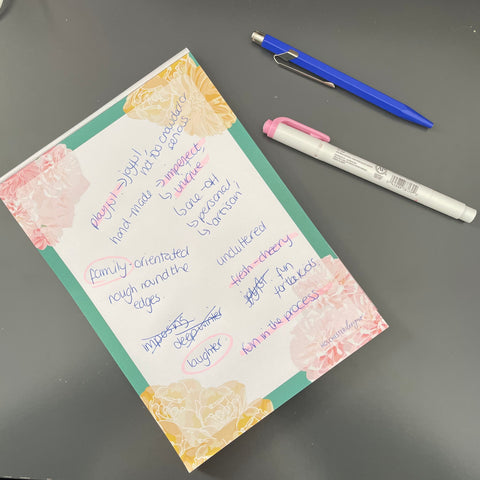
It might seem counter intuitive for what is primarily a visual activity, but I’d put money on the fact that you have a goal for what you want to get from your mood board and there are a few words that can sum that end point up. For instance, what do you want to feel from the room you’re planning, the product you want to create or the adventure you want to go on. Is it relaxing, calming, something unique, something special, vibrant, energetic.
Tip 2 – Gather together visual prompts
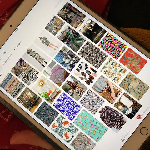
Next up I consider what visual prompts link back to these words. What colours, textures or even other brand names relate to ‘calm’ for you and embody those values. It may be green, jute textures and a business like The White Company. But it also might not, so what does?
Once you’ve got some visual prompts or terms collected look over them as a whole and see if you can spot any overarching themes. There’s bound to be some as your keywords were a basis, but I bet there’s be something that comes out you might not have predicted and that might be worth exploring more. It's those moments that usually uncover something a little more true to your subconscious vision.
Tip 3 – It doesn’t all have to be pictures
As you may have picked up by now, for me language is key to my process. As well as a starting point, as things develop sometimes there are words that are much more effective at pinpointing exactly what I’m after more specifically that an image – something that at a glance instantly hits the spot. I often add words to my moodboards, and have its visual equivalent too. It can really drive home certain elements of what I'm trying to achieve and can form a much clearer reference point too. If, however, when you're putting it together and reviewing it, having both is pulling too much attention pair it back to just either the words or image (which will depend entirely on how you're feeling, just go with your instinct).
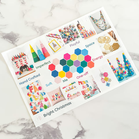
Tip 4 – Strike a visual balance
One thing I’ve not mentioned in this process is who the board might be for – most of mine are just for me, sometimes the family if it’s to do with the house and every so often for clients. If I am doing one for clients that I’ll include them in the keywords and exploratory phases so what comes out at the end is something that can easily decipher. If it’s just for me than some of the visual prompts might be a bit more abstract and not exactly how they appear, but that’s my own visual language and works for me.
And that, in a nutshell, is how to approach creating a mood board.
Pull together a visual language that resonates with you, without the pressures of do/don’t/rules/expectations and you’ll be well on the way to having solid foundations for the jumping off point of your project.
Pin Me for Later!