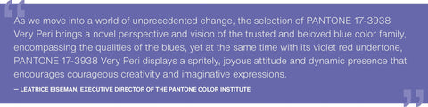
Very Peri was announced in December as the Pantone Colour of the Year - a brand new one that they created especially(!) - and whilst the hype around it has died down, the colour itself isn’t going anywhere. Following the Grey/Yellow combo of last year, this periwinkle colour is an interesting choice and not an easy one for small business owners to adopt. Not that it needs to be adopted - to be clear it absolutely doesn’t and it’s far more important that you stay true to your brand, it’s colours and it’s identity when working on your visuals.
BUT, USING COLOUR AS A LANGUAGE TO COMMUNICATE CAN BE A SUBTLE WAY TO ENGAGE WITH YOUR AUDIENCE AND POTENTIAL CUSTOMERS/CLIENTS AND THIS COULD BE A GREAT COLOUR TO PRACTICE WITH.
So, what things could you do to work with it in a way sympathetic to your business, brand and content? Here are a few ideas:

Using it can show a relevance and an awareness of the current trends - Pantone itself said this colour was a display about how digital colour trends are being seen in the physical world. Maybe you can play on it’s intensity and origins in digital design but using splashes on it on your social media visuals e.g. in the background of a mocked up image for a product, or shadow text for a quote or testimonial?

Play with the colour psychology side to it - blue, especially warm blues, generally have a sense of energy and pragmatism around them although it can easily sway to being overwhelming if it’s too rich or too cool. Purple also has a sense of energy to it, combined with strength which is rooted in its history as the colour of royalty as, until a chemical composition for the dye was found, it was an incredibly time and cost consuming colour to achieve. And whilst it may not be so overtly a royal colour these days, there’s still a sense of opulence and luxury to sitting down with a bar of Cadbury’s dairy milk, isn’t there? So, in practice, if you’ve got something needing visuals where you want to add a sense of warm positive energy combined with an opulence or limited edition feeling, then consider including a restrained amount of Very Peri.

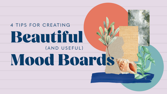
And finally, there’s always the no messing ‘here’s our take’ approach to including it. Take it as inspiration for a series of visuals around moving through the seasons, starting point for a mood board (I love a mood board) or the colour palette for a photography set-up. It may be a challenge to use it in such an all-encompassing way but that could be just the flex your creative muscles
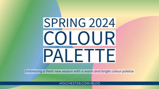
For this graphic I’ve gone a little over-board updated a pattern I use for my own image backgrounds and adapted the palette to use Very Peri and some complimentary shades.
If you’re after some colour palette ideas for using Very Peri then this ‘Palette Exploration’ post from Pantone is a great starting point, and of course Pinterest is a fantastic visual resource. Using it doesn’t have to feel inauthentic or forced, just be mindful of your reasons for doing so and then have fun!